A wall clock spends most of its life being looked at rather than read. You glance at it a few times a day, but it sits on the wall all day long, so it has to earn its place as a piece of decor as well as a way to tell the time. Many clocks fall short there, with plain faces that look like they belong in an office corridor.
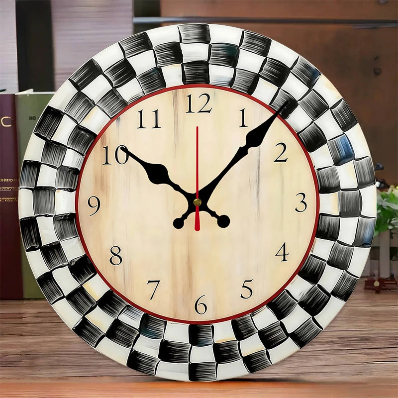
The Black and White Grid Wall Clock solves that with a strong graphic idea. A black grid pattern runs behind the numbers on a white face, so the clock reads as wall art even when nobody is checking the time. The high contrast also makes it genuinely easy to read, and a silent quartz movement means it never ticks its way into your thoughts.
What makes the grid clock stand out
The grid is the signature. Fine black lines behind the numbers give the face a structured, architectural look, somewhere between a sheet of graph paper and a modernist print. It is bold without being busy, and it suits rooms that like clean lines and a monochrome palette.
Readability comes with the design. Black lines and hands on a white face keep the contrast high, so the time is clear from across a room. That matters in a kitchen, a living room or an office where you want to check the time quickly without walking over.
The case is wood, which gives the clock more weight and texture than a plastic one. It looks intentional beside framed prints, shelving or a gallery wall, and it feels like a considered piece rather than an afterthought.
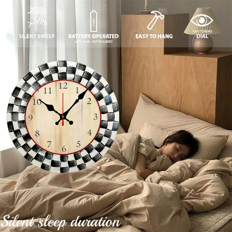
Then there is the sound, or the lack of it. The quartz movement runs silently, with no ticking second hand. In a study, a bedroom or a home office, a loud tick can become surprisingly distracting, especially late at night or during a video call. This clock keeps the room quiet.
Finally, hanging is simple. The hanging hardware is built into the back, so it mounts the same way as a picture frame, on a single nail or hook.
Where it looks best, room by room
- Home office. A quiet, readable clock above a desk that also works as art.
- Living room. Part of a gallery wall with black and white prints.
- Kitchen. A high contrast face that is easy to read while cooking.
- Bedroom. A silent clock that will not tick through the night.
- Hallway. A graphic accent on a narrow wall.
It is most at home in modern and mid century rooms, where its graphic look sits comfortably alongside other clean shapes. Because it is black and white, it works with almost any color scheme without competing with patterns already in the space, from bold rugs to printed cushions.
Choosing the size and placement
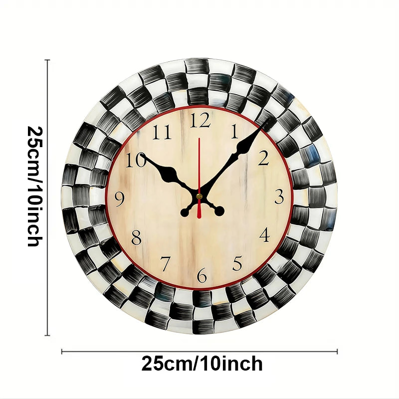
The clock is 10 inches across. At that size it works best as part of a group or on a smaller wall, rather than carrying a large, empty wall on its own. Think of it the way you would think of a medium framed print.
- Hang it at eye level or a little above, so you read the hands straight on rather than at an angle.
- On a gallery wall, place it slightly off center among prints of similar size.
- Above a desk, center it over the work area, leaving a hand's width or more above any shelf.
- In a kitchen, keep it away from the stove and sink, since the wood should stay away from damp.
- On a large blank wall, pair it with prints or a mirror so it does not look lost.
Before you hang it, fit the battery and set the time. The back is awkward to reach once the clock is on the wall, so doing this first saves a trip up and down. Batteries are not included, so have one ready when the clock arrives.
If you are building a gallery wall, lay the pieces out on the floor first and take a photo. That makes it much easier to find a balanced arrangement before any nails go in, and it helps you see how the grid face works alongside the other frames.
Pairing it with other pieces
A monochrome clock pairs naturally with black and white photography, line drawings and simple typographic prints. Black frames tie the group together, while natural wood frames echo the clock's case and warm the look. A small shelf beneath it with a plant and a few books softens the graphic lines.
Browse the wall clocks collection for other styles, or the wall decor collection for prints and pieces to build a gallery wall around it. For the shelf below, the floating shelves collection is a good next stop.
A table lamp with a white or black shade on a desk below echoes the palette, and a green plant adds a welcome touch of color to the monochrome scheme. In a mid century room, walnut furniture and brass accents look especially good against the black and white face.
Is the grid clock right for your space?
It is a strong fit if you:
- Want a clock that doubles as graphic wall art.
- Need a silent clock for a study, office or bedroom.
- Like a high contrast face that reads from across the room.
- Decorate in a modern, mid century or monochrome style.
- Are building a gallery wall and want a functional piece in the mix.
It is not the right choice if you want a large statement clock to fill a big empty wall on its own, since it is 10 inches across. For that, a larger clock will suit better. It is also a better fit for a dry room than a steamy bathroom, since the wood should be kept away from damp.
Every order ships free across the US and most arrive in 6 to 9 business days. Unused items in their original packaging can be returned within 30 days of delivery, and questions are answered at info@norafurnish.com within 1 to 2 business days.